Wireframe examples for websites and mobile app designs
By Wireframe.cc Posted on 4 minutes read

A successful wireframe requires a certain level of detail. You have to communicate your idea clearly without getting carried away with unnecessary details, colors, and illustrations. Take a look at the following examples of wireframes of websites and mobile apps. They may be a useful source of inspiration for your next design project.
Wireframe.cc is a wireframing tool built specifically for creating and sharing wireframes. Find out more...
Landing page wireframe

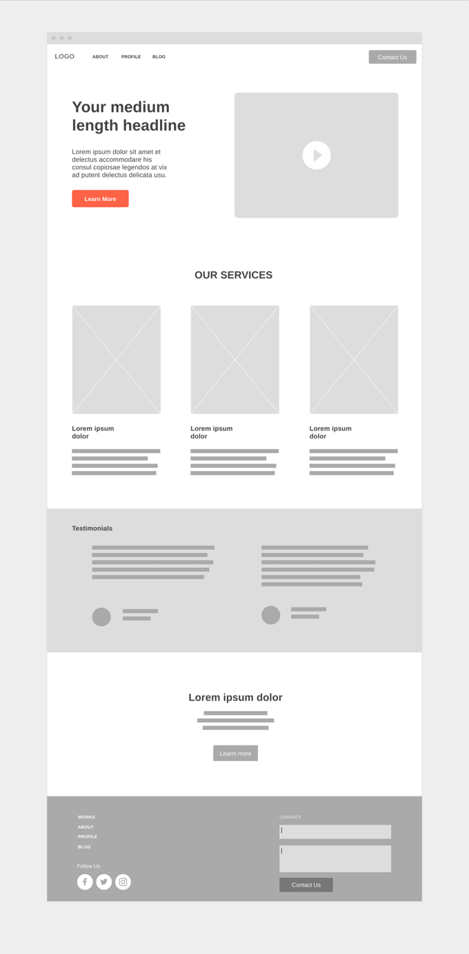
This simple low-fidelity wireframe example demonstrates how little is necessary to get the idea across. The actual text is used only to present the most prominent headlines and the paragraph located above the fold as well as links in the header and footer of the page. All the less prominent text elements are abstracted and only shown as blocks.
Crossed-out rectangles are usually enough to indicate placeholders for future images. A video player is depicted as a simple light grey box with an icon placed in the center.
The color palette of this wireframe is very limited. It uses a single accent color in addition to a few shades of grey. This way the most important elements can stand out while no unnecessary colors are used to decorate or style the wireframe.
Mobile app wireframe

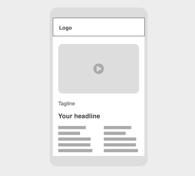
Even though it is perfectly correct to use a simple rectangle as a frame of your wireframe of a mobile app it may be better off with a device frame. While still simple, this kind of frame shows more context.
In this example, the navigation bar (also known as navbar) that sits on top of the app screen is represented by a simple white rectangle with a thin dark border. The video player on the other hand is a grey box with rounded corners and no borders. Depending on the level of importance of the text is shown as actual text or just some dummy text.
Everything that you need to create and share wireframes, nothing that would slow you down.
